The Safest Rooms to be Bold with Color
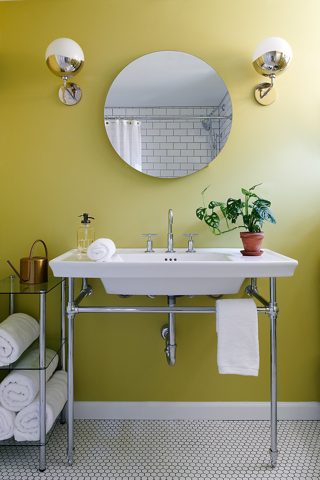
Project: Retro Garden View
Photo: Rebecca McAlpin
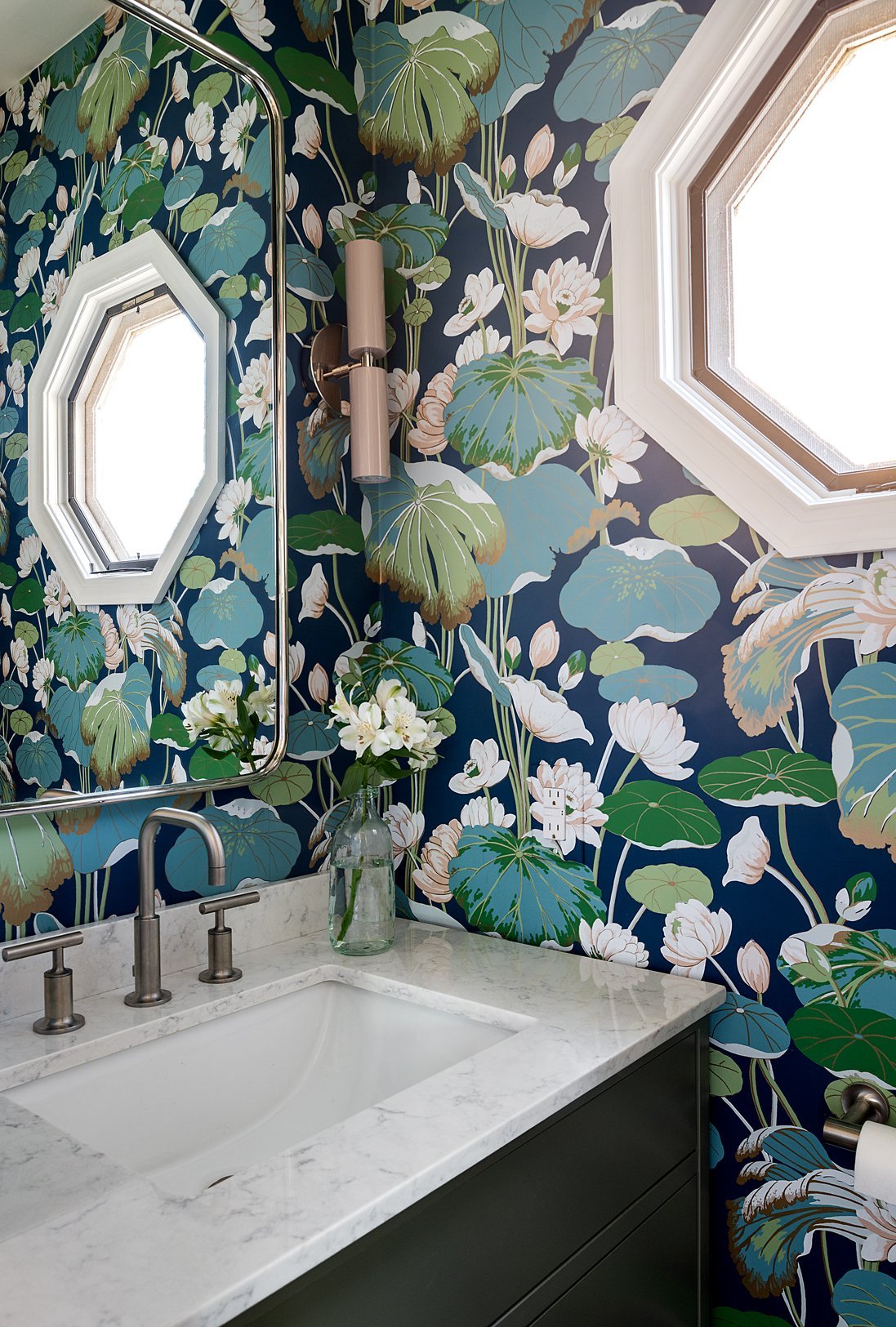
Project: Colorful Collingswood
Photo: Rebecca McAlpin
Most spaces I walk into are usually one of two extremes—either they’re beige and gray or they’re pink and maroon (remnants from the 50’s). That’s one reason homeowners call me—they’re tired of the existing color palette. However, some need to take baby steps toward utilizing daring colors in their home.
I have found that the easiest way to ease into bold tones is by using them in spaces that are used for the fewest periods of time or the least often. An example is a powder room or guest bathroom. It’s usually a smaller room so the thought of a bold hue is a bit less overwhelming. Further, if a guest doesn’t happen to love the bold color in the bathroom they don’t need to look at it for that long anyway!
One way to decide on a color is by pulling it from a piece of artwork, like what we did on the Salt Lake City to Philly project.

Project: Salt Lake City to Philly
Photo: Kate Raines
Most of the tones in this piece of artwork are neutral with the exception of Babar’s red tie and the green mantle in the background. My client happens to love green, so we decided to go in that direction and paint the wall behind the mirror a vibrant green (Sherwin Williams Lime Rickey to be exact). The rest of the walls were left white.
Since we only used the accent color on one wall, it’s not overwhelming. In addition, you don’t see that color at all until you walk into the guest bathroom, so it’s a bit unexpected and you can’t see it from the bed in the adjacent guest bedroom. The vanity is a mid-toned wood and all the fixtures are either black or white so there isn’t any visual competition among colors.
Color can seem daunting, but it doesn’t have to be. Give us a call to see how we can help!
Related Blog Posts